
Featured Illustrator: Mary Hays
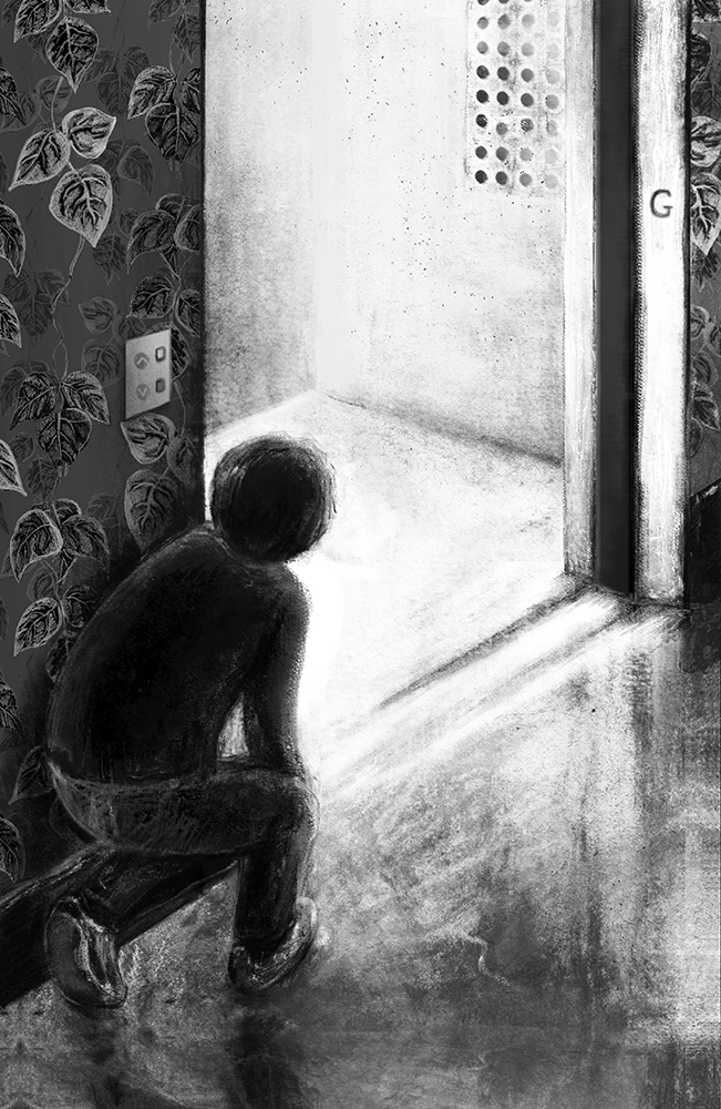 |
| The Fast Way Up |
It was wonderful to be selected as one of the SCBWI Undiscovered Voices 2016 illustrators with my picture The Fast Way Up. Serendipitously, when I read about the competition I realised I had already made an image that, with a bit of tweaking, would fit one of the categories, Jack and the Tower Block. The original drawing was one I had done for a book by John Farndon called The Whisperers (not with a publisher yet). The original was in colour, which I easily converted to a black and white interpretation for the story concept. I added vine-leaf wallpaper to evoke the beanstalk from the traditional tale along with a few details to make the lift more convincing as a visual narrative.
 |
| Tai and the Lift |
Last year I completed an MA in Children’s Book Illustration at Cambridge School of Art. I started the course thinking that it would be useful as a point of re-entry into the creative industry after being home for several years raising a small child. Having a child rekindled my love and value of illustrated books, and as I lived practically around the corner from Cambridge School of Art, it seemed like a very obvious thing to do.
What I hadn’t given much thought to before the course, was the infinite variety of angles from which you could approach the process of creating an illustrated book. I had not fully appreciated the truly wonderful creative possibilities of children’s books, and doing the best possible work you can do, by following your own vision, or, finding your own “visual language” as we were taught on the MA course. This is both a liberating and a complicated notion, and requires some grappling with. What could be easier, or more difficult, than authentically expressing yourself on paper? I found I needed to look back at the things that had shaped me.
Here is a picture by my favourite cartoonist Michael Leunig which I think illustrates the joy of embracing who you are and where you come from, with all its quirks. (I apologise for the creases but this newspaper cutout has travelled more than 10,000 miles with me and has been pinned in several locations.)
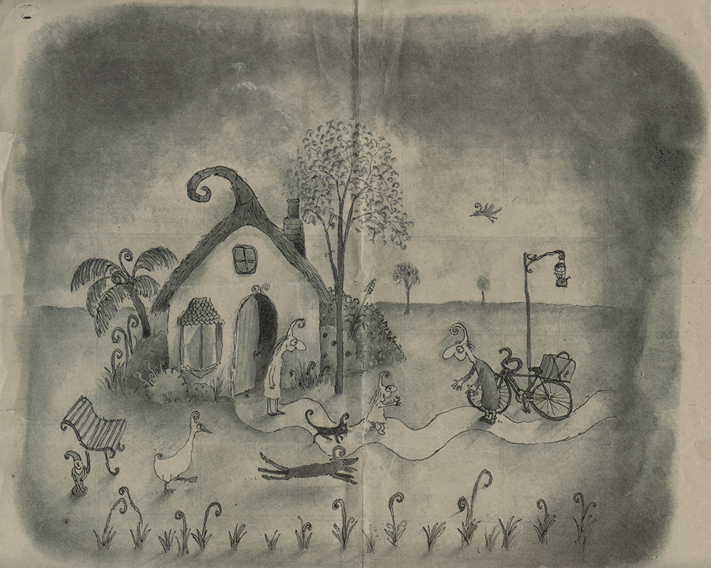 |
| Mr Curly Comes Home (Melbourne Age, Good Weekend 13/6/98) |
My mother was a potter, painter and textile artist amongst other crafts. Our house, which was a modern house for 1960s Australia, had ceiling to floor windows all down one side, full of changing light and shadows, colour, texture, things from nature, and things being made. Wet clay, raw fleece, skeins of spun wool, weaving, knitting, jute, macramé, silk, dye, wax, flowers, bark, leaves – I think these textures and shapes from my childhood, and the distinctive light and shadows, led me towards a very tactile way of working and depicting forms.
At 17, I began two foundation years in Art and Design. At this point, it seemed I had to start thinking about what I was really going to do as a career. I realised that architecture (my first inclination) was not an option when I dropped maths at the first opportunity.
Then I discovered what I really, really LOVED, and that was printmaking. I loved the way it involved a process, like alchemy. The way the results were revealed in one gentle peeling back of the beautiful paper. Ta da! I loved the craft of it. I loved that the craft was born from a desire to communicate more widely. And I particularly enjoyed the way the plate imparts a texture upon the paper. At least three of my teachers were professional printmakers, so I felt it was something that could be taken seriously.
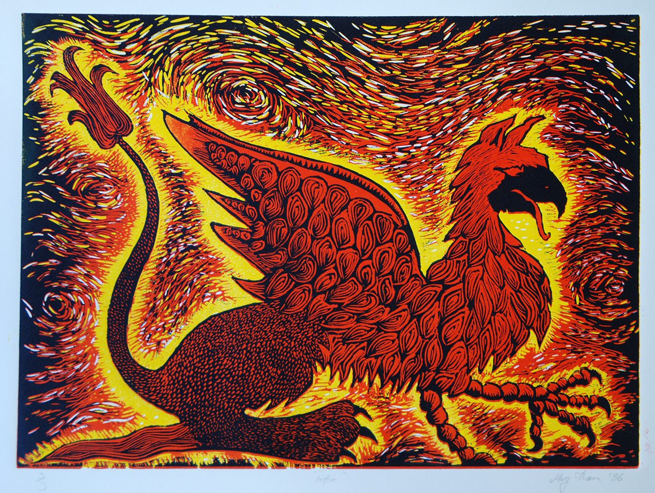 |
| Griffin linocut |
One of my first prints was a 3 colour reduction linocut inspired (rather heavily) by Maurice Sendak’s griffin in The Griffin and the Minor Canon by Frank R. Stockton, a book I still cherish.
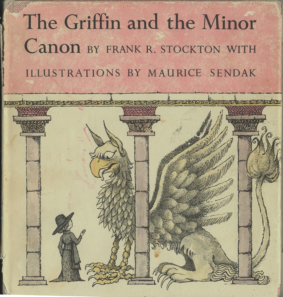 |
| The Griffin and the Minor Canon (Collins 1968) |
John Burningham’s, Borka is the picture book from my childhood that left the deepest impression on me. There are many others that I remember very fondly but when I examine the pictures in Borka now, I realise I must have seen it at that critical moment when a small child imprints on a particular kind of image.
 |
| Borka, The Adventures of a Goose with No Feathers (from title page, Red Fox edition 1999) |
I completed my BA degree in Fine Art Printmaking at Victoria College of the Arts in Melbourne Australia. After art school I moved around a bit, spending a couple of years teaching English in Bangkok and enjoying getting lost in the chaos there. Then I made my way across Europe and settled in Cambridge where I worked for nine years as a graphic designer at a software company before leaving to have a baby.
Last year I enjoyed participating in SCBWI’s Collaborative Master Class with Sam Arthur from Flying Eye Books. The theme was ‘family dynamics or diversity’ and I chose to use a cat as my protagonist. I like to explore different ways to illustrate mood and emotion. So in my story about Henry, the cat, who is usurped by a newborn baby, I used baby grows drying on the line to emulate oppressive clouds above him kicking at his drooping head. The technique is monotype. I paint (Akua intaglio ink) onto a clear acrylic sheet (with sketch visible underneath) and run it through my etching press with a sheet of damp BFK Rives Blanc paper. Monotypes give quick results in my limited allotment of art time. (I usually follow up with quite a lot of Photoshop colour work later).
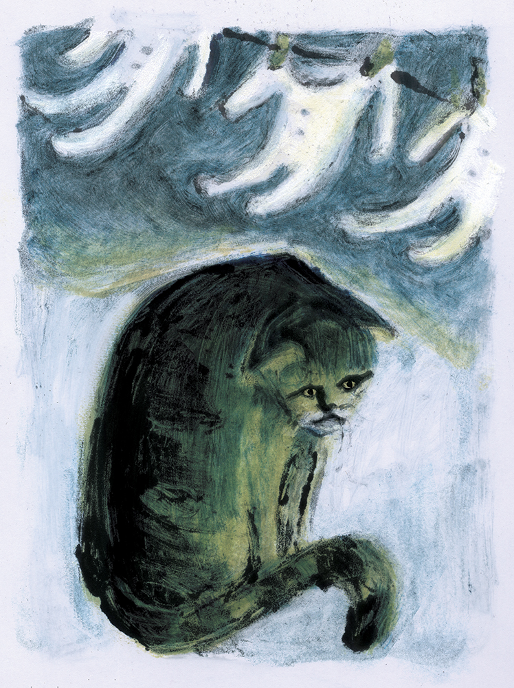 |
| Sad Henry |
There is a happy ending.
 |
| Happy Henry |
Illustration provides the opportunity to present actors and actions, convey feelings and atmosphere but also, excitingly, to create spaces or whole worlds for the viewer to enter and explore. So happily it seems I can be an architect after all!
+++++++++++++++++++++++++++++++++++
Don't forget to check more of Mary's work in her Featured Illustrator Gallery.
Her personal website is here. Contact Mary by email here.


What a wonderful feature. I love the insight Mary provides into what has inspired her creative process. Jin
ReplyDelete