
ILLUSTRATION KNOWHOW From sketch to colour

A lot of illustrators have moved from traditional media to digital media such as Procreate. This comes with its own hurdles. Illustration Editor Shannon Ell shows you one of many ways to render your digital illustrations beautifully.
This tutorial will go through a step-by-step process, from the reference stage right to the final touches.
Reference images
With whatever your subject matter is, it’s always best to put together things like mood boards.
For this particular illustration, the subject is self-portrait character design. The idea is to have an animated character at the end of the process. This particular illustration is concept art which will eventually be simplified down into a fully-rigged character.
After looking up different wild west cowboys and gunslingers and putting together a script and mood board, it’s time to take some reference photos. This helps with proportions and foreshortening. You can then upload it onto your digital drawing software and begin to sketch out and stylise your illustration.

Sketches
Once you’ve got all of your reference images such as clothing and poses, you can then use a light brush (here I’ve used JingSketch sketch round brush) to roughly and quickly draw the shapes and lines where bones and joints would be.


Colour & Outlines
There are many ways of illustrating with colour. Personally, I’m a bit chaotic in my approach. However, it’s good to separate the outline layers and the block colour layers. For outlines I use a brush that comes with Procreate, Dry ink, and for colour I use 6B pencil. This gives an almost traditional media texture to my work. I almost never outline hair as this gives it more flow.


Before I go on to adding shadows and light, I usually give the hair more texture by adding different shades of the base colour.
Final Touches: Shadow and Light
After blocking out the base colours, I then grab a very pale lilac to block out where the shadows are. I generally push the opacity to 40% and use the multiply effect to give that lovely idea of depth. I do this twice with two separate layers.
Finally, I use a pale yellow overlay layer with the opacity at 40% to add in any highlights, then add in the final touches with a thin white line on the top layer set to normal at 60% opacity. This final form of light really makes the illustration pop.

.png)

*All images ©Shannon Ell
*
Contact me at llustrators@britishscbwi.org
*
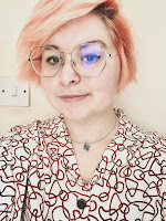
Shannon Ell is a non-binary illustrator, animator, and designer based in Edinburgh. They created Miles The Cat at the beginning of the lockdown to feature on their socials, providing fun and relatable PSAs. Miles is based on Shannon's rag doll cat and is also the main character of the picture book Shannon is working on.
Instagram: @shannon.illustrates
*


No comments:
We love comments and really appreciate the time it takes to leave one.
Interesting and pithy reactions to a post are brilliant but we also LOVE it when people just say they've read and enjoyed.
We've made it easy to comment by losing the 'are you human?' test, which means we get a lot of spam. Fortunately, Blogger recognises these, so most, if not all, anonymous comments are deleted without reading.