
ILLUSTRATION KNOWHOW Create a strong image: using colour

Picture books are all about storytelling and communicating with the reader. Design and Value are basic building blocks for a good illustration. However, adding colour makes it interesting and captivating.
Colour and lighting can be used very effectively in storytelling.
Colours help tell the mood and time of the story. For instance, to create the feeling of night time we use more of the darker values of colours (dark blue, dark green). For cool mornings and bright sunny afternoons, brighter and lighter tones of the same colours (light, cooler blue, brighter greens) are used.
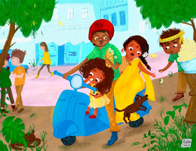 |
| Rekha's illustration showcasing brighter and lighter tones (Credit: Rekha Salin) |
Brighter and saturated colours are used for happy and cheerful storytelling and muted colours in situations where we want to create a mood of sadness or convey a more sober feeling.
- Creating Harmony: Analogous colours are together on same side of the colour wheel. They sit next to each other. For example – red, red-orange, orange. These colours create harmony in an illustration and make everything look well tied together. You can see them used a lot in nature and in cases where you do not want something to stand out, but want everything to blend together. However, too many analogous colours can make a scene look boring. There is nothing to look for and everything looks similar.
- Creating Contrast: Complimentary colours are on the opposite side of the colour wheel and they are used to create a contrast. An example of a complimentary colour would be red and green. Complimentary colours are used to create interest as they stand out. However too many uses of complimentary colours will take away the focus. One of the best ways to use colours in an illustration is to have a mix of analogous colours and then creating focal points and areas of interest using the complimentary colours.
 |
| Example of creating a focal point with harmony and contrast (Credit: Rekha Salin) |
Working with a very limited palette helps with keeping it simple and yet have effective storytelling. Even if you love using a lot of colours in your work, do remember that they are grouped in values, and only the focal points or area of interest stand out.
So choose your colours and colour palettes, keeping your story in mind.
 |
Rekha Salin has three books published as an illustrator. Two picture books, one in 2020 and the other in 2022, and also a recipe book (for adults) in 2022 published by ABV publisher. She is currently working with Gnome Road Publishing, and this will be available in 2024. See more of Rekha's work here. Follow her on Instagram and on Twitter.
*

Ell Rose is the Illustration Features Editor of Words & Pictures.
Find their work at www.fourfooteleven.com
Follow them on Instagram and Twitter
Contact them at illustrators@britishscbwi.org
Tita Berredo is the Illustrator Coordinator of SCBWI British Isles and the Art Director of Words & Pictures. She has a Master's degree in Children's Literature and Illustration from Goldsmiths UOL and a background in marketing and publicity.
Follow her on Instagram and Twitter or www.titaberredo.com
Contact her at: illuscoordinator@britishscbwi.org


No comments:
We love comments and really appreciate the time it takes to leave one.
Interesting and pithy reactions to a post are brilliant but we also LOVE it when people just say they've read and enjoyed.
We've made it easy to comment by losing the 'are you human?' test, which means we get a lot of spam. Fortunately, Blogger recognises these, so most, if not all, anonymous comments are deleted without reading.