
ILLUSTRATION KNOWHOW Digital Adjustments

Whether it’s for reproduction or sending to publishers, most illustrators eventually face the need to convert their artwork into digital format. If you only work with traditional media and feel a bit lost, Illustration Editor, Tita Berredo, offers a few beginner steps that will help you digitise your work with quality.
Once you have digitised your artwork you will need to make adjustments to correct the colour, the contrast, etc. This is a simple task that can be done in most editing softwares. For this purpose we will show this on Photoshop.
Picture Fashion
Determines the number of colours displayed in an image. The main modes are RGB (Red-Green-Blue), the colour model for digital imagery used for displaying digital work on screen; and CMYK (Cyan-Magenta-Yellow-Key/Black), the colour model for printed materials. In short, use RGB for images displayed on screens and CMYK for printing. Do not worry if it changes the way the original colours look, you can adjust all that later.
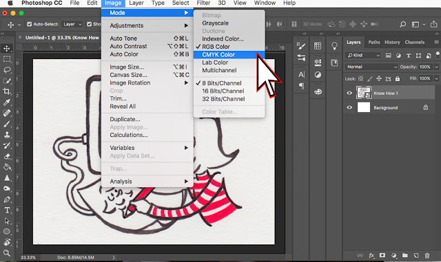 |
| In the menu bar, select Image > Mode and make your selection. |
Brightness and Contrast
Brightness is the overall lightness or darkness of the whole image. Contrast is the difference between light and dark areas in the image – increasing it makes light spots lighter and dark spots darker.
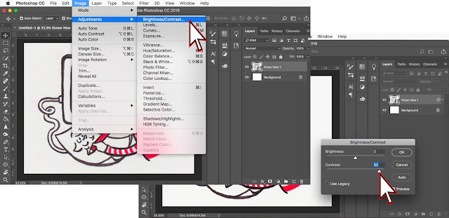 |
In the menu bar, select Image > Adjustments > Brightness/Contrast. Use the slider to adjust. |
Exposure
Corresponds to the amount of light present in the image, just like underexposed photos are too dark and overexposed photos are too light. Note that the exposure affects highlight tones, differently than the brightness which affects the whole image equally.
 |
In the menu bar, select Image > Adjustments > Exposure. Use the slider to adjust.
Colour Balance
Used for colour correction, the balance changes the overall mix of colours in an image. You can adjust each cast separately and also by individual tone: shadows, mid-tones, and highlights.
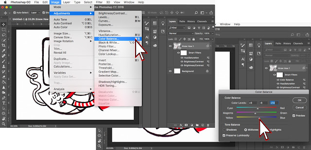 |
In the menu bar, select Image > Adjustments > Color Balance. Use the slider to adjust. |
Hue and Saturation
Hue corresponds to the colour spectrum, and saturation to the purity (amount of light) in colour. You can play with the hue to change the range of colours in the whole or a portion of the image.
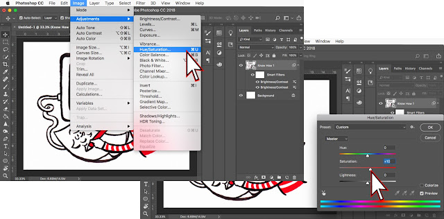 |
| In the menu bar, select Image > Adjustments > Hue and Saturation. |
All images © Tita Berredo

Tita Berredo is Illustration Features Editor for Words & Pictures. She has a Master's degree in Children's Literature and Illustration from Goldsmiths UOL, and a background in social communications, marketing and publicity. www.titaberredo.com
Jo. E. Verrill is Knowhow Editor. If there's something you'd like to know how to do, send your suggestions to knowhow@britishscbwi.org


Thanks for clear concise info Tita
ReplyDeleteMy pleasure!
Delete