
Picture Book Basics - Character Dynamics

In the third part of a series on Picture book Basics we're looking at characters. Successful Picture Books, especially those for younger children, can hinge on the design of it's cast. So what makes a great character? Here are just a few ideas to explore.
We all have different styles, techniques and approaches, so I'm not attempting a universal guide, but I hope this is of relevance to all illustrators, nomatter what your style. For me, the key elements of a good character are:
- Immediacy - it should be instantly recognisable.
- Pathos - it should carry an emotional appeal for the reader
- Flexibility - the character should be adaptable to a variety of situations and be easy for the illustrator to reproduce in successive spreads.
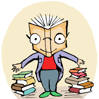
Simplicity is the key to strong characters. Some illustrators convey convincing emotion with the most minimal of designs or simplest of lines, for example....
 |
| © Peter H Reynolds |
Find some element or detail that makes your character unique within the setting, something that makes it stand out from other background figures, for example striking hairstyle, identifiable clothes, distorted facial features or expression. Using colours or patterns that stand out from the background and which contrast with other figures can be very effective. Accessories can also help - you only have to think of Peter Rabbit's blue jacket, or the Cat in the Hat's hat. sometimes these elements can be the springboard for stories.
 |
| David McKee's iconic Elmer - strong character colours against a more subdued background. In many of the Elmer books the patchwork colours are the key to the story, the nature of the character itself creates the tales. ©The Andersen Press |
Illustrators often start with sketching character ideas. So, look at your character studies and consider, is this a picture of the character at the beginning of a story, or at the end? Sometimes the very thing that makes the character unique can be the source of a story. How did they reach this condition?
Expression
Experiment with the size and position of facial features, the eyes, the nose, mouth, forehead etc. We’re programmed to find babies faces attractive (both animal & human!), thus characters with infant-like feature proportions are appealing, larger heads on smaller bodies, smaller chins, lower faces etc. Try drawing the character’s face in different emotional states - happy, sad, surprised, cross etc.Avoid cartoon generic stereotypes, like big bug eyes with white highlights (ala Disney), perpetually grinning "happy" faces, or manga - cartoons use these graphic short-cuts to thrust their message forward, picture books on the other hand are more sophisticated and subtle, they invite the reader into a more refined world, and characters should reflect this.
Pose
Once you have an idea of the appearance, try drawing the character in various poses, from various angles. Include plenty of movement - running, climbing, bending over, sitting down etc. Personally I tend to design characters in curves rather than angular straight lines as this naturally leads to more naturalistic figures. Don't worry about reproducing every muscle, but it might help to keep in mind the poise and lightness of ballet and the stage, also how emotion and movement is conveyed in silent movies - body language that is emphasised, but not over-exaggerated. Try holding the pose yourself, feel where your weight rests, which muscles are used, the tension of the pose. Then exaggerate slightly in your drawing. |
| a progression of early development sketches - all curves! |
While comics often require very dynamic characters, in picture books vulnerability can be very effective, as it again appeals to our subconcious love of helpless infants - aim for tenderness and charm, but not over-sentimentality. Characters should be attractive, but not maukish.
Character Connections
Think how characters interact with each other and their environment - show them exchanging glances, use body language to indicate their connection with others on the page, look for the visual dialogue offered by the composition. The character should fit in with the world around them, the setting may also dictate the mood of characters. How does the environment affect your character? How are they feeling? What are they thinking? Place yourself on the page with the character, consider how their surroundings might affect them. |
| © Tor Freeman has a masterful sense of narrative |
These are just a few things to ponder, I hope these ideas help to grasp characters that connect with readers.
All images © the artists and publishers
-------------------------------------------------------------

He's illustrated over 40 books for children, many of them published in Japan where he lived for many years. His latest title The Stone Giant is out in Japan now, and will be released in English by Charlesbridge in the US in Spring 2014. www.jshelley.com


Thanks, John - useful and thought-provoking.
ReplyDeleteUseful tips on emphasising body language and drawing in curves. Love the Peter Reynolds image, too.
ReplyDeleteExcellent and particularly enlightening for me as a non illustrator, thank you John.
ReplyDeleteIntriguing, John. I was especially interested to read your comment about avoiding cartoon shortcuts. So it doesn't depend on the style of drawing?
ReplyDelete