FEATURED ILLUSTRATOR Francesca Resta
This month's Featured Illustrator is London-based Francesca Resta. Originally from Italy, for several years Francesca has been based in UK, where she specialises in tightly observed bookcovers for older age groups. See more of her work in the Featured Illustrator Gallery.
I was born in an industrial city in northern Italy, known for steel factories. It’s a place where it’s difficult to see art as a real career, so I studied mathematics and started to work as a web developer, while always keeping art as a hobby.
My love for drawing is very connected to my love for books. As a teen, I used to learn the names of the cover illustrators of the books I loved and try to recognize their work on the shelves of the local bookstores. John Jude Palencar, Michael Whelan and Larry Elmore are very much responsible for my love for fantasy art.
Always a strong reader of fantasy and sci-fi novels, I started going to book fairs and this brought me to meet independent authors and small publishers: these encounters led me to my first collaborations. Very very slowly, it became a steadier job and I gradually stopped working as a developer.
In the following years, I worked with some of the biggest publishers in Italy and in the States, like Mondadori, Giunti, Penguin, Harper Collins, Simon and Schuster and several others. I’ve been selected in annuals like Infected by Art (in the US) and Autori di Immagini (in Italy).
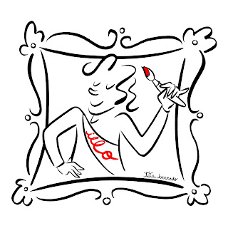
Moving to London five years ago has been incredible for me: I’m deeply in love with this city with its museum and opportunities and people that come from every place of the world with a luggage full of dreams. In an attempt to give back, I’m a volunteer visitor host at the Tate Modern.
 |
| At the Tate |
Still, for my process I prefer digital: it lets me change my mind faster and also react more easily to the client’s feedback, but I hope that in the future I will find the confidence to add more techniques to my client work.
My education consists of a lot of workshops, online courses and manuals. I also find life drawing extremely important, and I try to attend a session every week. Thanks to workshops, I met some of my art heroes, like Brom in Rome two years ago or Lisbeth Zwerger in Milan too many years ago. Online schools like SmArt School and Schoolism are also an incredible resource that makes up for my lack of institutional education, I’m very thankful to be living in the digital era!
I think directly on the paper, so I often start by writing down words or concepts that I associate with the book, filling the page with very messy sketches even I can’t recognize after a few months. Once I have an idea of what I want on the cover, I start thinking about the composition with some thumbnails. This phase is only for me: it can be more detailed or extremely rough, I’m just testing out ideas and sometimes I immediately understand it’s not what I want and sometimes I need to bring it a bit further.


No comments:
We love comments and really appreciate the time it takes to leave one.
Interesting and pithy reactions to a post are brilliant but we also LOVE it when people just say they've read and enjoyed.
We've made it easy to comment by losing the 'are you human?' test, which means we get a lot of spam. Fortunately, Blogger recognises these, so most, if not all, anonymous comments are deleted without reading.